
Medical beauty design Hangzhou 2018Year 500㎡
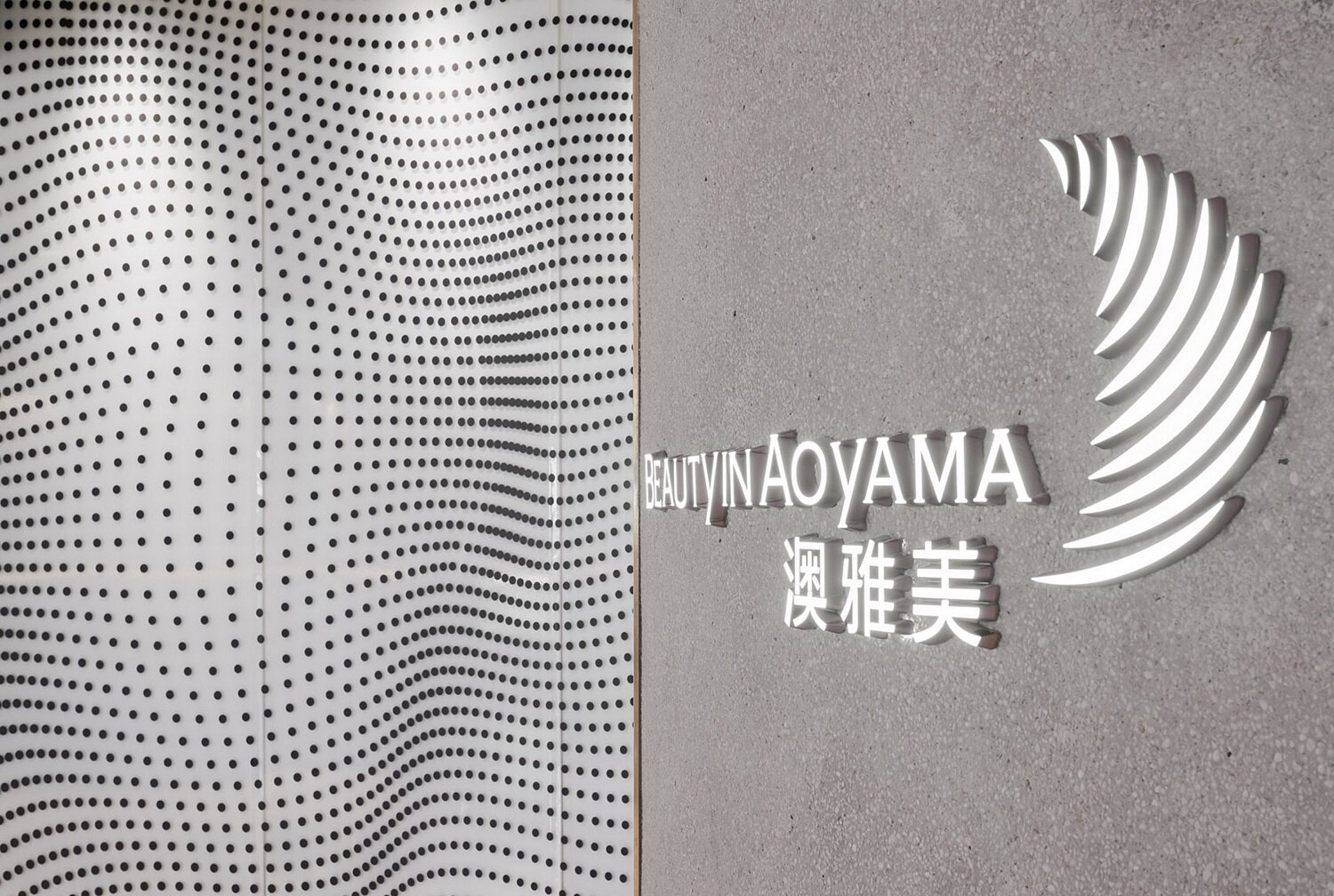
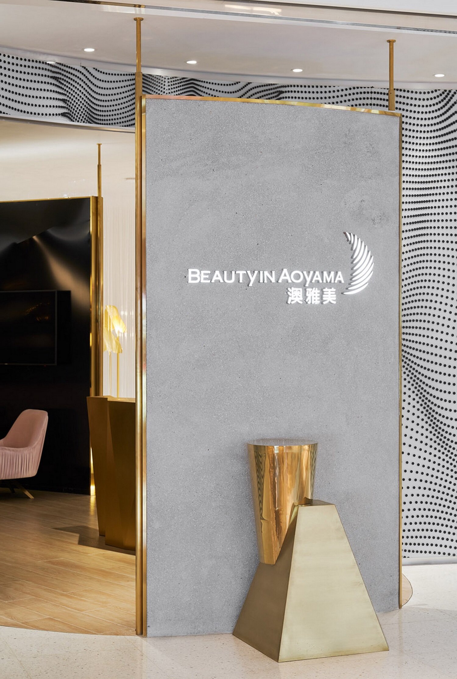
Beauty comes from self-confidence. You don't need gorgeous make-up. If you wear a gorgeous coat from your heart, your skirt will fly. Therefore, the design is positioned as simple and elegant space, reflecting a kind of soft and confident tension. The double arc setting at the entrance enhances the sense of substitution.
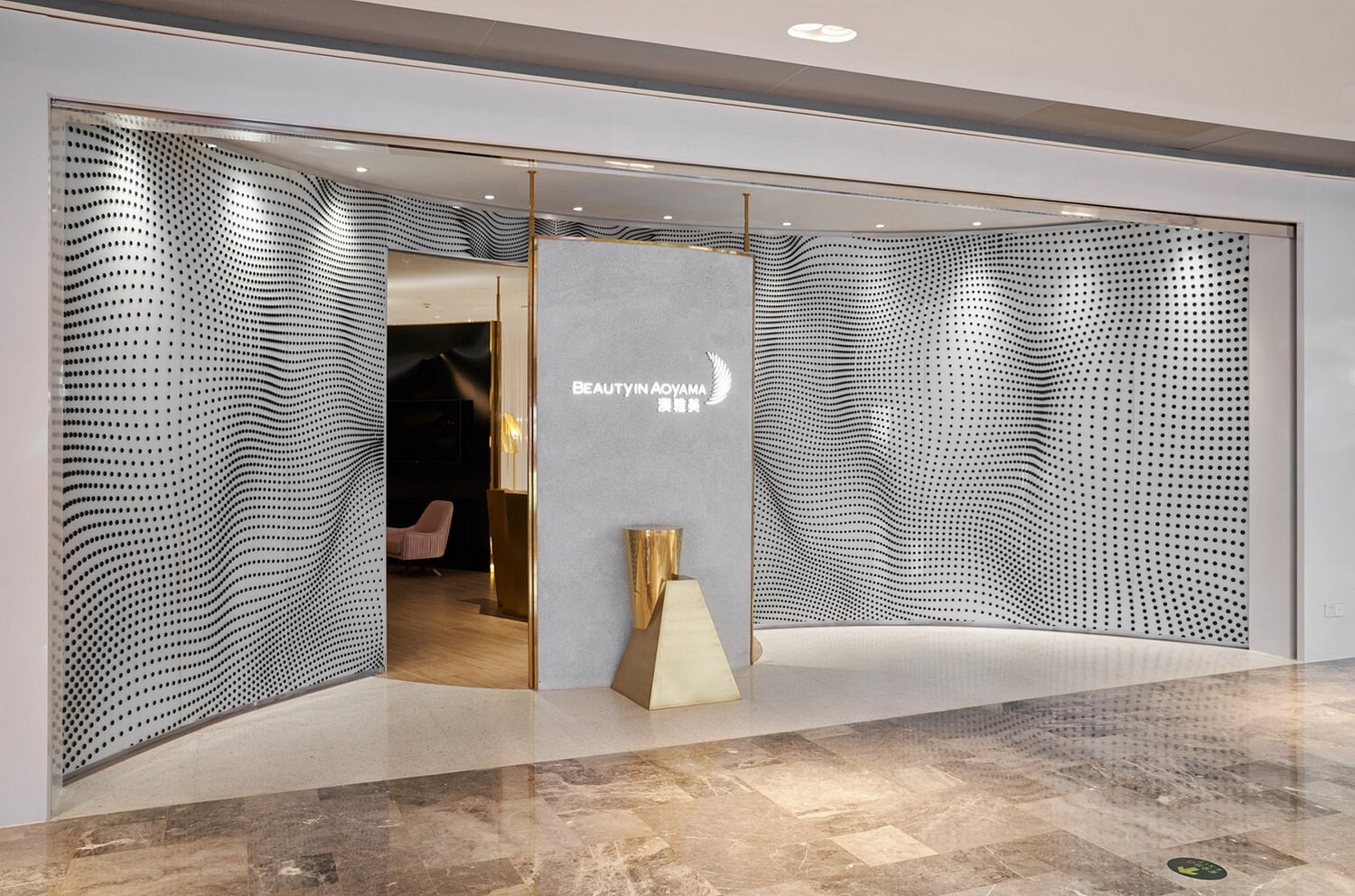
▲Entrance design of AOYAMA Beauty Center
Curved glass with dot matrix pattern creates dynamic vision. In the oval vestibule, the use of black high light soft film to create a sense of oppression of the skin, as a prelude to release.
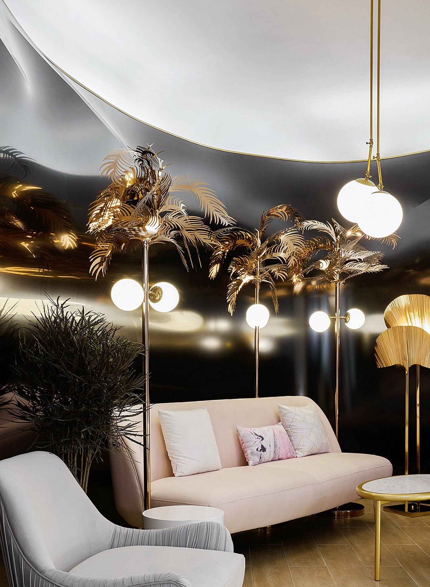
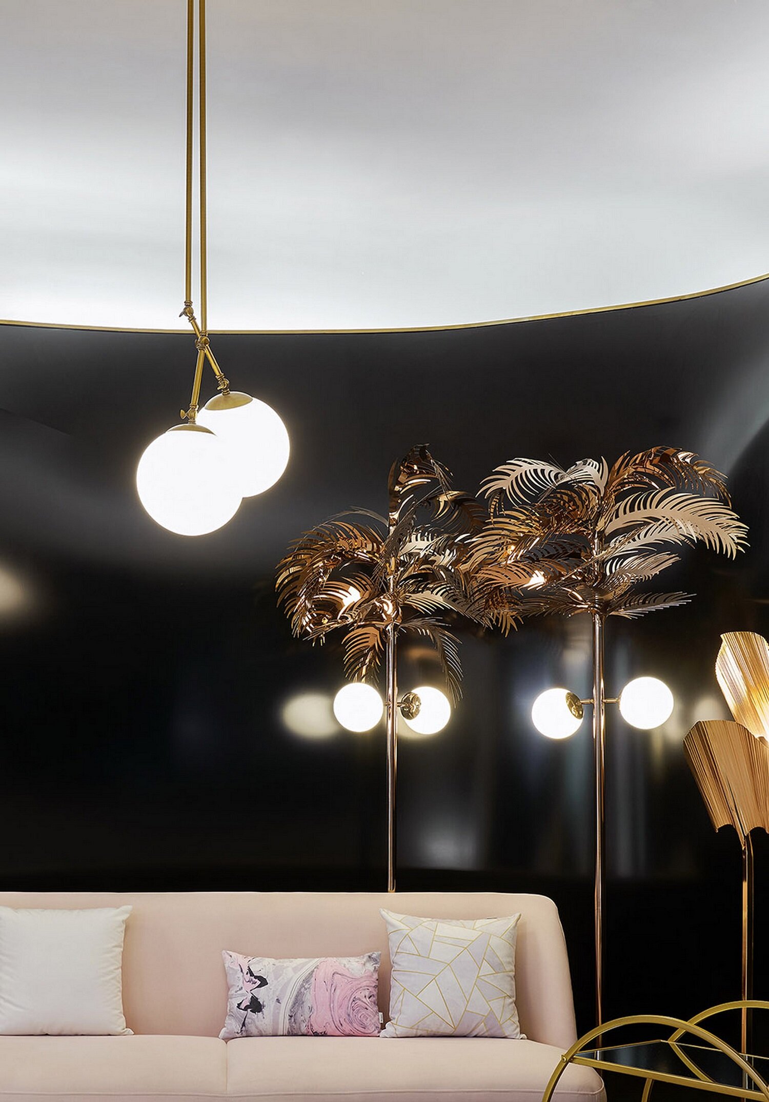
▲Aoyama beauty center rest area design

▲ Corridor design of AOYAMA Beauty Center
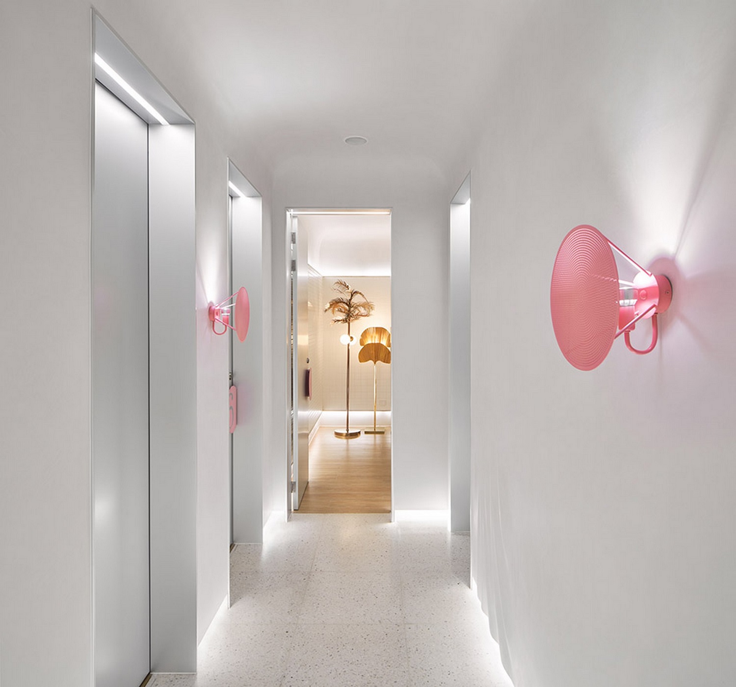
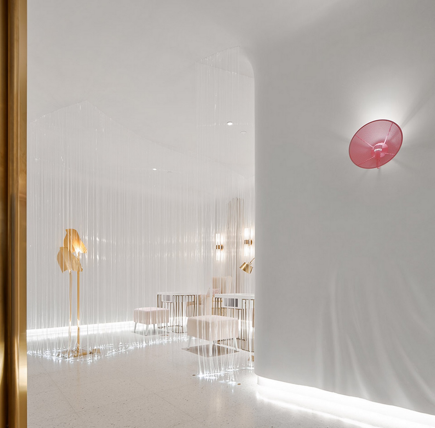
The traditional top lighting is not used in the passageway of beauty area. The design theme is combined with GRC to create the curve of skirt flying on the original rigid wall, and the bottom diffuse light source is used to make the space rise to a soft feeling. The pink wall lamp further increases the light level and is also the guide sign of each compartment. In the space where the area is not easy, the vision is expanded with almost pure white color. Through the correlation of light and shadow, material, texture and line, the variety of changes is reflected. The aim is to endow Aoyama with the dual attributes of elegance and professionalism.

▲Aoyama Beauty Center Nail Room Design
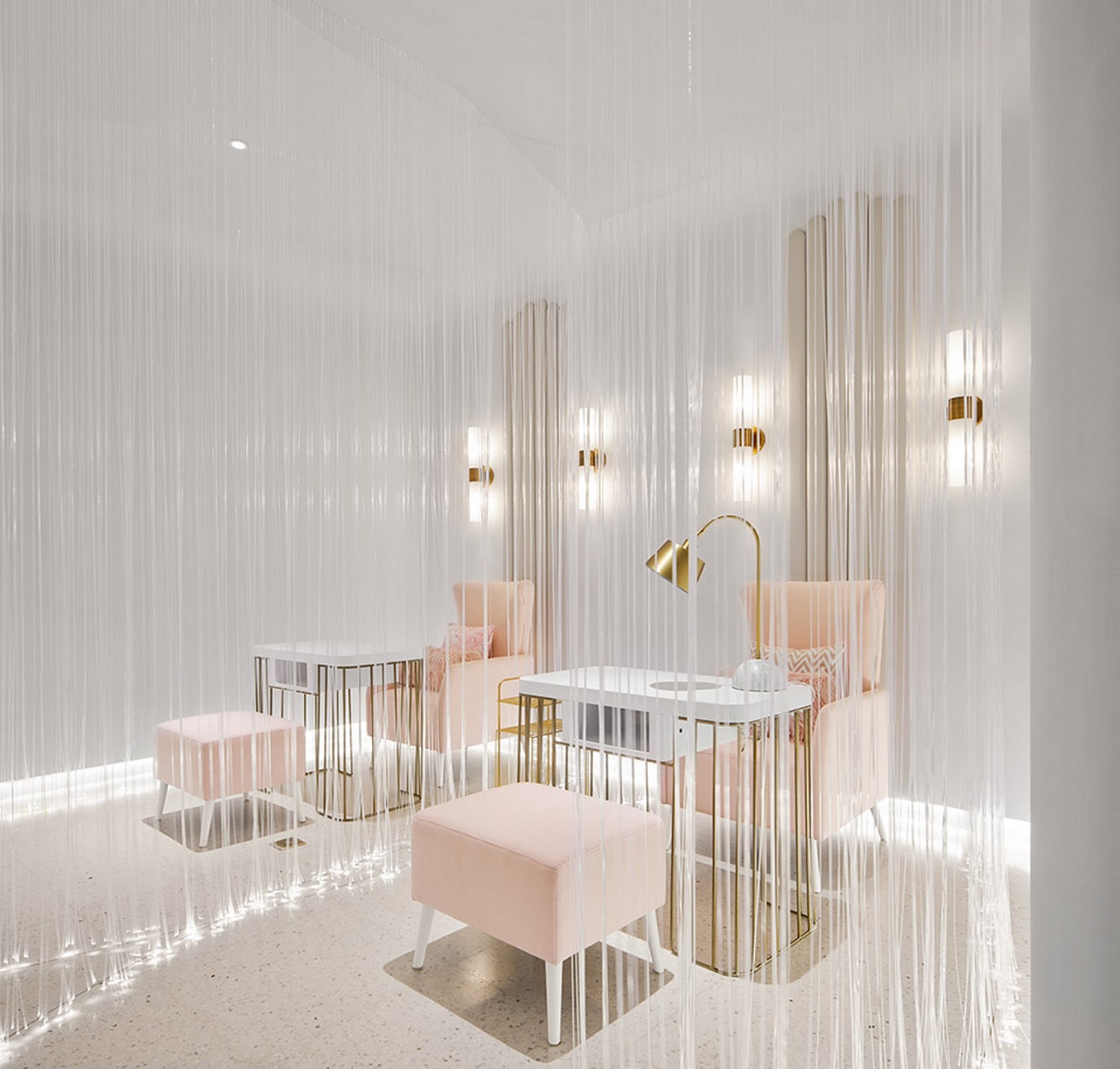
▲Aoyama Beauty Center Nail Room Design
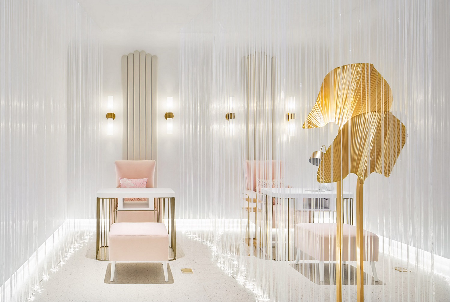
▲Aoyama Beauty Center Nail Room Design
Entering the main hall, the first display is the manicure area composed of hundreds of optical fiber wires, supplemented by the main guest seat with a sense of ceremony, presenting the originally boring manicure process in a dreamy atmosphere.
The manicure area is composed of hundreds of optical fiber wires
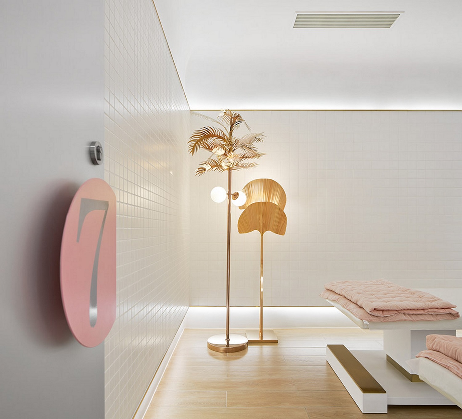
▲Aoyama beauty center beauty room designs
On the atmosphere in the beauty room, the upper and lower sections are separated by three specifications of white ceramic tiles. The skirting line is cancelled through the protruding wall shape at the lower part, and the ground return light is added. The upper horizontal line at the same height as the door is visually expanded, and the built-in light refracts the wall, making the space atmosphere quiet and soft, and avoiding the light shadow produced in the working process.
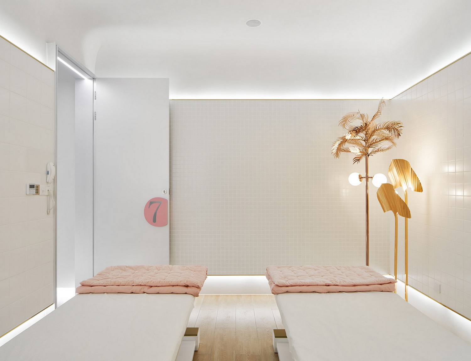
▲Aoyama beauty center beauty room designs
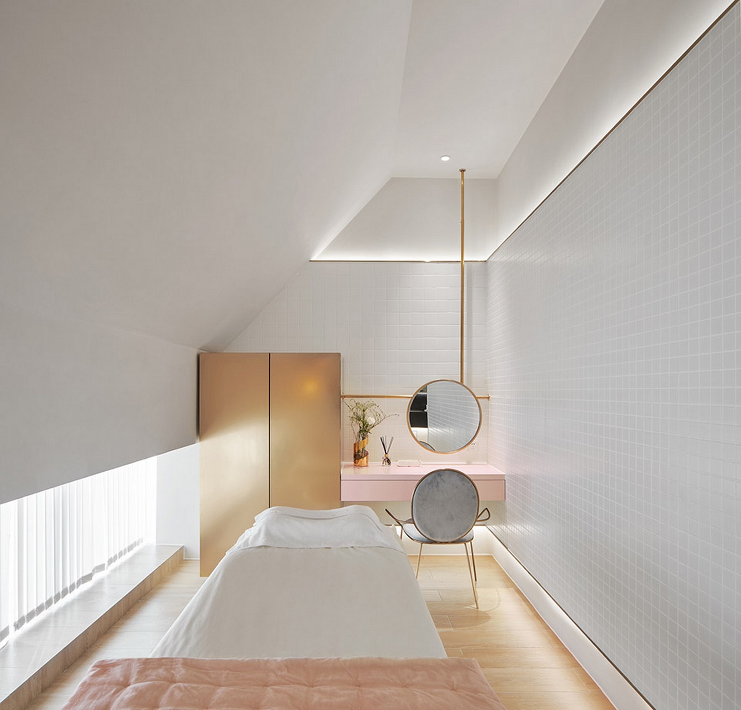
▲Aoyama beauty center beauty room designs

▲Aoyama beauty center beauty room designs
Note: This case is for reference only!

300㎡ 2018Year Beijing China
Narcissus beauty beauty chain store is a high-end private precision skin care brand chain organization in Beijing. The design project covers an area of 300 square meters, and aims to crea...

800㎡ 2019Year Beijing
The soft pink color renders the whole space, creating a sweet mood like a girl's pink candy dream, making people feel beautiful and relaxed. The flowing glass top, the falling star li...

2450㎡ 2017Year Taipei City
Located in the center of Taipei, the base floor is narrow and deep, and the building is shaped into a narrow, long and tall body, with a height of 13 floors; on the plane configuration, t...

1800㎡ 2016Year Chongqing
Oval egg shape, breaking out of the shell, gestating life, natural growth...

2000㎡ 2018Year France
理疗中心设计...

800㎡ 2018Year Chengdu
Rongde medical center is located in the radiation surrounding of Chunxi Road, a fashion landmark in Chengdu, reflecting the rich and fresh life art of the city. From the perspective of mo...
Design experience
Provinces covered
Serving customers
Service area for customers